Using anchors can be efficient enough to handle multiple resolutions. But as the UI gets more complex, they become difficult to use.
A way we can handle more complex and advanced layouts is by making use of Containers.
Container Layout
When a Container node is used, any Control nodes that are a child give up their ability to position themselves. The parent container will handle all of these nodes position and sizes. Manually changing the child nodes position or size will either be ignored or invalidated the next time the parent is resized.
When a container is resizes, all of its children are repositioned and resized as well:
Size Flags
When adding a control node to a container, the way a container treats a child depends mainly on their size flags. These can be set on each control node by using the horizontalFlags and verticalFlags properties.
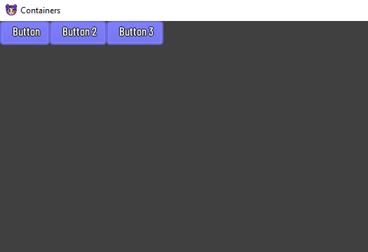
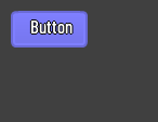
hBoxContainer {
    button {
        text = "Button"
        horizontalSizeFlags = SizeFlag.FILL or SizeFlag.EXPAND
    }
    button {
        text = "Button 2"
        horizontalSizeFlags = SizeFlag.FILL or SizeFlag.EXPAND
    }
    button {
        text = "Button 3"
        horizontalSizeFlags = SizeFlag.FILL or SizeFlag.EXPAND
    }
}
Size flags are independent of vertical and horizontal sizing and not all containers make use of them:
- Fill: Ensures the control fills the designated area within the container. No matter if a control expands or not, it will only fill the designated area when this is toggled (control nodes use this by default)
- Expand: Attempts to use as much space as possible in the parent container. Controls that don’t expand will be pushed away by those that do. Between expanding controls, the amount of space they take from each other is determined by the stretch ratio.
- Shrink Center: When expanding (and not filling), try to remain at the center of the expanded area. By default, it remains at top or left.
- Stretch Ratio: A ratio of how much expanded controls take up the available space in relation to each other. A control with a stretch ratio of
2will take up twice as much available space with a control with1.
Container Types
There are several out of the box container types:
Box Containers
HBox
Arranges child controls horizontally while expanding vertically (via HBoxContainer).
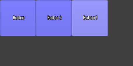
hBoxContainer {
    button {
        text = "Button"
        horizontalSizeFlags = SizeFlag.FILL or SizeFlag.EXPAND
    }
    button {
        text = "Button 2"
        horizontalSizeFlags = SizeFlag.FILL or SizeFlag.EXPAND
    }
    button {
        text = "Button 3"
        horizontalSizeFlags = SizeFlag.FILL or SizeFlag.EXPAND
    }
}
We can also use row instead which is the same as hBoxContainer.
row {
    button {
        text = "Button"
        horizontalSizeFlags = SizeFlag.FILL or SizeFlag.EXPAND
    }
    button {
        text = "Button 2"
        horizontalSizeFlags = SizeFlag.FILL or SizeFlag.EXPAND
    }
    button {
        text = "Button 3"
        horizontalSizeFlags = SizeFlag.FILL or SizeFlag.EXPAND
    }
}
VBox
Arranges child controls vertically while expanding horizontally (via VBoxContainer)
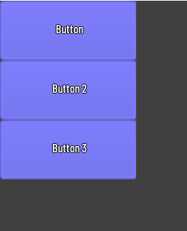
vBoxContainer {
        text = "Button"
        verticalSizeFlags = SizeFlag.FILL or SizeFlag.EXPAND
    }
    button {
        text = "Button 2"
        verticalSizeFlags = SizeFlag.FILL or SizeFlag.EXPAND
    }
    button {
        text = "Button 3"
        verticalSizeFlags = SizeFlag.FILL or SizeFlag.EXPAND
    }
}
We can also use column instead which does the same as vBoxContainer.
column {
    button {
        text = "Button"
        verticalSizeFlags = SizeFlag.FILL or SizeFlag.EXPAND
    }
    button {
        text = "Button 2"
        verticalSizeFlags = SizeFlag.FILL or SizeFlag.EXPAND
    }
    button {
        text = "Button 3"
        verticalSizeFlags = SizeFlag.FILL or SizeFlag.EXPAND
    }
}
Center Container
Arranges child controls directly in the center (via CenterContainer).
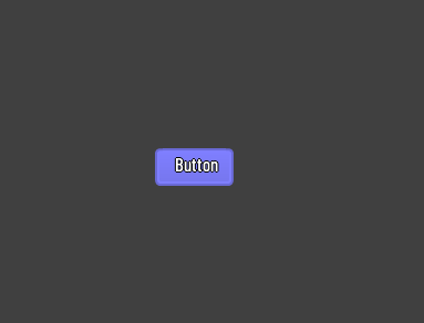
centerContainer {
    anchorRight = 1f
    anchorBottom = 1f

    button {
        text = "Button"
    }
}
Padded Container
Arranges child controls that are expanded toward the bounds (via PaddedContainer) with an additional padding that will be added to the margins which can be configured by the theme.
paddedContainer {
    padding(10)

    button {
        text = "Button"
    }
}
Panel Container
A container that renders a Drawable and expands its children to cover the whole area (via PanelContainer).
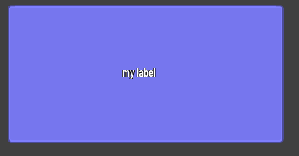
panelContainer {
    width = 400f
    height = 200f

    label {
        text = "my label"
        verticalAlign = VAlign.CENTER
        horizontalAlign = HAlign.CENTER
    }
}
Scroll Container
A container that will automatically create a ScrollBar child (HScrollBar or VScrollBar or both) when needed. (via ScrollContainer).
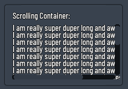
scrollContainer {
    minHeight = 100f
    vBoxContainer {
        repeat(20) {
            label {
                text =
                    "I am really super duper long and awesome label ${it + 1}"
            }
        }
    }
}
Custom Container
It is also possible to create our own container. All we have to do is extend the Container class and implement logic on sorting the child controls and calculating size. Here is an example of implementing a container that centers its children:
class MyCustomContainer : Container() {
    override fun onSortChildren() {
        nodes.forEach {
            if (it is Control && it.enabled) {
                val newX = floor((width - it.combinedMinWidth) * 0.5f)
                val newY = floor((height - it.combinedMinHeight) * 0.5f)
                fitChild(it, newX, newY, it.combinedMinWidth, it.combinedMinHeight)
            }
        }
    }

    override fun calculateMinSize() {
        if (!minSizeInvalid) return

        var maxWidth = 0f
        var maxHeight = 0f

        nodes.forEach {
            if (it is Control && it.enabled) {
                if (it.combinedMinWidth > maxWidth) {
                    maxWidth = it.combinedMinWidth
                }
                if (it.combinedMinHeight > maxHeight) {
                    maxHeight = it.combinedMinHeight
                }
            }
        }

        _internalMinWidth = maxWidth
        _internalMinHeight = maxHeight
        minSizeInvalid = false
    }
}