A Control is the base node that all UI related nodes are inherited from. The Control node handles all the functionality for updating anchors, margins, and sizes based on its parent control or the viewport. For more information on how anchors and sizes work check out the Size and Anchors page.
Using a Control
Every Control comes with its own builder method to be used within a SceneGraph or Node scope. They generally use the name of the node class in lowercase form. The method also accepts a callback lambda that can be used to initialize and implement that functionality of the control.
button {
    text = "Hello!"
}
Input
The SceneGraph manages the input and passing down input events through scene’s root. Input events, such as, hovering with a mouse or focusing with a keyboard, are forwarded through the graph until a Control node marks the event as handled in the uiInput(InputEvent) method.
Only one Control can have keyboard focus at a time. When a Control receives or loses keyboard focus, the onFocus and onFocusLost callbacks are invoked to handle the event. To request focus of a Control we can call the grabFocus() method.
Theme
When a theme is set on a Control node, it affects all of its children. To override some of the theme values, use one of the _override maps defined in the Control class. See Themes for more information on how to use themes.
Types of Controls
The following list will only include non-container controls. For a list of containers, check out the container types.
Base Control
The base control (via Control). Contains no renderable components.
control {
    name = "GUI"
}
Button
A standard themed button (via Button) that can contain text and is displayed according to the Theme.
button {
    text = "Click me!"

    onPressed += {
        log.info { "I was pressed!" }
    }
}
Label
Displays plain text (via Label). Allows control of the horizontal and vertical alignments.
label {
    text = "My label"
    horizontalAlign = HAlign.CENTER
    verticalAlign = VAlign.CENTER
}
LineEdit
Renders and a single line of editable text (via LineEdit).
Contains commonly built in shortcuts:
- Ctrl + C: Copy
- Ctrl + X: Cut
- Ctrl + V: Paste
- Ctrl + Z : Undo
- Ctrl + Shift + Z: Redo
- Ctrl + A: Select all
lineEdit {
    placeholderText = "Enter your username"
}

lineEdit {
    placeholderText = "Enter your password"
    secretCharacter = '-'
    secret = true // will render the text as a '-' instead of the default '*'
}
NinePatchRect
Creates a ninepatch by slicing up the texture into nine patches (via NinePatchRect) which produces clean panels of any size, based on a small texture by splitting it into a 3x3 grid. The drawn, the texture tiles the textures sides horizontally or vertically and the center on both axes but doesn’t scale or tile the corners.
ninePatchRect {
    texture = myTextureSlice
    left = 3
    right = 3
    top = 3
    bottom = 3
}
Panel
Displays an opaque background (via Panel). Commonly used as a parent.
panel {
    label {
        text = "Hello! I have an opaque background!"
    }
}
ProgressBar
Generic progress bar / slider (via ProgressBar) that shows the fill percentage from left to right.
progressBar {
    value = 50f // or we can do 'ratio = 0.5f'
}
TextureProgress
A textured-based progress bar (via TextureProgress). Useful for loading screens and health bars.
textureProgress {
    background = atlas.getByPrefix("healthBarBg").slice
    progressBar = atlas.getByPrefix("healthBarProgress").slice
    foreground = atlas.getByPrefix("healthBarFg").slice

    value = 100
}
TextureRect
Draws a texture slice (via TextureRect). It can scale, tile, and keep centered inside its bounding box.
textureRect {
    slice = myTextureSlice
    stretchMode = TextureRect.StretchMode.TILE

    // this is false by default. Useful for positioning the TextureSlice based off the original size before packing and trimming.
    useOriginalSize = true
}
ScrollBar
An abstract Range-based Control that displays a draggable area (page) (via ScrollBar). See HScrollBar or VScrollBar in order to use it.
vScrollBar {
    page = 10f
    height = 100f
}
hScrollBar {
    page = 10f
    width = 100f
}
Custom Control
For something not available out of the box, we can go about creating our own implementation by extending a Control. There are a few things we need to ensure we do in order for it to be used properly by parent containers and such.
Calculating Size
Override the calclateMinSize() method from Control. This is where we should place our calculations for determining the minimum size that a control should be. How that is calculated is up to you. For example, the below code is calculating the minimum size by taking the bigger value of the background drawable size or the specified minWidth / minHeight properties.
We need to ensure we set the _internalMinWidth and _internalMinHeight properties of the control. Notice the underscore _. Do not set the properties internal size properties that do not start with an underscore. Doing so will cause an infinite loop of minimum-size calculations.
override fun calculateMinSize() {
    // we should ensure we check minSizeInvalid is false then we don't want to recalculate
    // doing so will just waste resources
    if (!minSizeInvalid) return

    _internalMinWidth = max(minWidth, bg.minWidth)
    _internalMinHeight = max(minHeight, bg.minHeight)

    // ensure we set minSizeInvalid to false after we finish calculating.
    minSizeInvalid = false
}
Handling Input Events
Overriding the uiInput() method allows the Control to view any input events that make it through the graph to the node. The InputEvent contains information on what type of event has occurred, and what invoked the event (key, pointer, movement, etc). We can then mark the event as handled if we want to ensure that the event doesn’t propagate down to any other controls.
override fun uiInput(event: InputEvent<*>) {
    super.uiInput(event)

    if (event.type == InputEvent.Type.TOUCH_DOWN) {
        // handle touching / mouse click
    }

    if (event.type == InputEvent.Type.KEY_DOWN) {
        if(event.key == Key.SPACE) {
            // handle key event
            event.handle() // marks the event as handled.
        }
    }
}
We can also handle focus events via onFocus() and onFocusLost():
override fun onFocus() {
    // handle focus
}

override fun onFocusLost() {
    // focus lost
}
Rendering
In order to render a Control we have access to the render() method that we can override. The method is provided with a Batch instance that we can use to draw any textures and such to the screen as well as the scene’s Camera instance.
override fun render(batch: Batch, camera: Camera) {
    super.render(batch, camera)
    batch.draw(
        textureSlice,
        x = globalX,
        y = globalY,
        scaleX = globalScaleX,
        scaleY = globalScaleY,
        rotation = globalRotation,
        colorBits = color.toFloatBits()
    )
}
Debugging
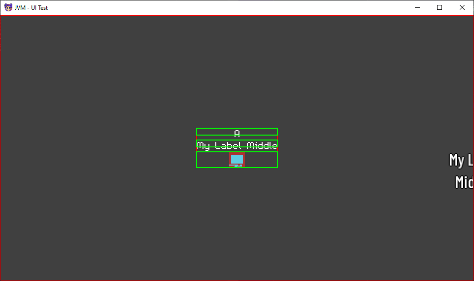
Debug Render
The scene graph contains a flag showDebugInfo that is set to false by default. Setting this to true will allow the CanvasLayer to call the interal debug render method to allow propagation through the tree. This will ultimately invoke the debugRender method in a node.
A Control node, by default, overrides the debugRender and will render the bounds of the node. This is useful for helping with the positioning of the UI. We can override this method to provide our own debug rendering of any sort.